Using a single dashboard, you can monitor, analyse, and visualise all of the critical business data from Google Analytics, Amazon Web Services, Twitter, and GitHub, among other sources. Logging into the dashboards of each individual tool in order to monitor and visualise the important data would be a time-consuming process, especially when taking into consideration the growing number of tools that we have for social media, analytics, and other purposes. If you spend a significant amount of time in a variety of administrative panels and dashboards, you will require a centralised solution that will allow you to view everything on a single dashboard. Do you require something similar to this at this time?
DashThis
DashThis is an automated reporting tool designed to save time and create quick marketing reports for marketers, agencies, franchises, small businesses, and freelancers. Listed as Canada’s Fastest-Growing Company in 2020, DashThis offers a simple analytics dashboard that can be customized to fit business requirements. With over 34 connected integration data managers, DashThis provides data and KPIs at your fingertips.
The platform offers built-in marketing templates for easy customization, allowing you to create reports every time from scratch. The platform also offers bulk dashboard creation and editing services for those with hundreds of dashboards to edit and import data. Users can share dashboards easily by adding colleagues and giving them access to create and edit dashboards.
DashThis can integrate seamlessly with various platforms like Google Analytics, AdWords, Facebook Insights, Twitter, LinkedIn Page, Instagram Ads, Yahoo, YouTube, Bing Ads, Moz, SEMrush, and Ahrefs. It also offers a white label feature for customizing dashboard URLs and importing data using the CSV file importing system. With thousands of digital marketers and agencies from 122+ countries using DashThis, they can create swift marketing reports easily.
![]()
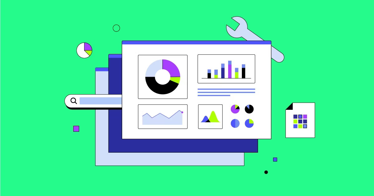
Improvado
Improvado can help you connect your marketing data to a wide variety of services, like Amazon S3, Google Big Query, Google Sheets, Tableau, Google Data Studio, Looker, and more. Your marketing department will be able to leverage it with zero engineering demands thanks to its support for 200+ connectors like these. Popular ones like Shopify, Salesforce, Instagram, HubSpot, LinkedIn, Excel, Qlik, Domo, and MySQL and MariaDB are also part of this set of connectors.With Improvado’s unified dashboard, you can save all of your marketing data in one place and use your preferred tools to visualise it.
Furthermore, you can execute basic or advanced data transformations using its data transformation system, depending on the needs of your business. Improvado ensures that raw data and simplified reports are always available when needed. This means you can find more relevant responses more quickly. Improvado gives you the power to transform your company’s data utilisation by allowing you to create personalised dashboards for display ads, Amazon performance, and YouTube marketing.

FusionCharts
The adaptable and interactive charts, consistent API, cross-browser compatibility, and comprehensive documentation of FusionCharts allow you to build fantastic web and mobile dashboards. More than two thousand choropleth maps and one hundred graphs, gauges, and charts are at your fingertips.
FusionTime provides next-gen dashboards with stock charts and strong time series. Enable your users to easily export dashboards as PDFs or send them as an email attachment. Retrieve all possible chart types, including bar, area, column, pie, and line.
In addition, there are a plethora of domain-specific charts available, including heatmaps, gantt charts, gauges, spider charts, waterfall charts, treemaps, and marimekko charts, among many more. You may use the time-series visualisations to see how thousands of data points relate to your Internet of Things apps. On top of that, you’ll have a bunch of alternatives when it comes to installation, like CDN, straight JavaScript, and NPM. To aid developers in finishing projects more quickly, FusionCharts makes use of plugins and front-end connectivity.

Monday.com
Utilise management software that provides a comprehensive overview at a glance to make informed decisions for your organisation with efficiency. It’s Monday.com, and it has everything you need to keep tabs on schedules, finances, and progress, as well as make your own dashboards. The reports are also easy to visualise because to the summary of each detail.
Data tools allow you to exchange files, assign tasks, prioritise them, know who is working on what at any given moment, and make smart decisions. With the adaptable board, players never lose sight of the end objective.
Views such as a calendar, timeline, and charts can help you keep tabs on your progress. To maximise efficiency, it’s important to have a bird’s-eye view of your team’s resources so you can see how each person is performing. Instead than wasting time on menial activities, let your staff concentrate on what’s really important. There is no cost to use Monday.com’s resources to handle the full procedure for up to two seats. You can take advantage of a 14-day free trial and plans starting at $10/month/user if you require more than two seats.

Reportz
Keep tabs on all your marketing data with Reportz’s unified reporting solution. You’ll never have to worry about reports again. It is as simple as making a dashboard, sending a link to it to your team, and then visualising. Getting key performance indicators (KPIs) and real-time data from your marketing streams is a good place to start, and then you can quickly customise your dashboards. With Reportz, you get a white-label-ready dashboard that’s easy to use and understand.
They made sure to incorporate features for marketing tools, real-time data access with various points, and automation when designing it. All of these features allow you to create reports in minutes rather than hours, which is a significant improvement over manual approaches. Date ranges (days, weeks, or months) are available, but you also have the option to provide your own. In addition, they will be introducing dashboard templates for several report kinds, including content marketing performance, social media activity, SEO key performance indicators, link building, and more.
Google Ads, Google Analytics, Instagram, Salesflare, Google My Business, SERPstat, Google Sheets, SERanking, WooCommerce, MailChimp, and many more applications may be integrated with Reportz. Plus, Reportz has your back when it comes to security; you can set up passwords to protect your KPI dashboard. Another option for keeping your dashboards secure is to refresh their URLs before sharing them with clients or reliable coworkers.

Zoho Analytics
When it comes to creating web dashboards that offer informative business information, Zoho Analytics is among the easiest tools to use. Two million people rely on this business dashboard, which 14,000 clients use. Countless well-known brands rely on it, such as IKEA, Canon, COMCAST, Citrix, Dell, HP, and countless more.
Producing informative dashboards and reports on key performance indicators (KPIs) is made easier with its detailed and granular metrics, which include charts, widgets, pivots, etc. Its dashboard is flexible, allowing users to easily track key performance indicators (KPIs), share results with colleagues or superiors for additional analysis, and more.
It’s easy to set up automatic report scheduling, and the reporting is thorough, allowing for accurate data insights. With Zoho’s formula engine, users may create new formulas to extract mathematical and statistical functions, allowing for deeper insights. You can access it quickly across numerous devices, including PCs, laptops, tablets, and mobile phones, thanks to its adaptability. Dashboards for Sales, Finance, Project Management, Marketing, Helpdesk, and Support are just a few of the many uses for this feature-rich business tool.

klipfolio
Among the best cloud-based web tools, Klipfolio can help your company expand by analysing data, creating visual representations of measurements, and keeping tabs on key performance indicators (KPIs). You can use it to find, see, and share data as it happens. You can also look at your company’s growth over time by comparing it to previous records.
Klips and PowerMetrics are Klipfolio’s two flagship products. With Klips, organisations can easily build and distribute informative dashboards and reports to all parties involved. As its name implies, PowerMetrics is an all-inclusive tool for turning raw data into metrics. This, in turn, allows for the provision of timely and significant business insights, which in turn lead to growth, competitive advantage, and improved decision-making.
Klipfolio can access data from a variety of sources, including on-premises storage, cloud applications, spreadsheets, SQL databases, etc., allowing users to create dashboards and derive relevant insights. With its handy web-accessible resource connector, you can draw your company’s data from any application, from marketing to finance, thanks to its hundreds of connectors. This will provide you real-time access to the data you need to make business choices.